By Claudine Raschi, MS · Last updated: October 2026
Quick Answer: What Is Quota Attainment Distribution Analysis and How Does It Diagnose a Broken Comp Plan?
A quota attainment distribution analysis charts every rep’s attainment in a histogram to show whether quotas and pay fit reality. A healthy curve is bell-shaped near 100 percent. Top-heavy, bottom-heavy, two-peaked or flat curves point to quota-setting, territory or plan design problems.
What Is Quota Attainment Distribution Analysis?
Quota attainment distribution analysis looks at how attainment is spread across the whole sales team, not just the team total. You chart each rep’s result for a period, group the results into bands, and read the shape. The shape tells you whether quotas, territories and plan mechanics are working together.
The average hides almost everything. A team at 100 percent of plan can be a few reps far above quota and many far below, or nearly everyone grouped near goal. Those two teams have the same top line but may need very different fixes.
This post covers the diagnostic layer. For the planning work that comes first, see our guide to sales territory and quota planning. For mid-year fixes, see when to give sales quota relief.
Why Review the Attainment Distribution Every Period?
A review that checks only totals, did we hit the number and did compensation cost stay near budget, cannot tell you why the result happened. Alexander Group’s quota distributions analysis article advises analyzing quota distributions at the end of each performance period, and its author notes that in one quota seminar, less than 40 percent of executives said they track and review them regularly.
The same guidance says an unbalanced attainment distribution leads to low morale, increased turnover, and under- or over-payment of incentives. We read the curve alongside those outcomes.
How Do You Run a Quota Attainment Distribution Analysis?
You need clean attainment data by rep, a simple histogram, and several ways to slice it. This routine follows Alexander Group’s quota distribution guidance, and the curve is a starting point for investigation, not proof of a cause.
- Define the data first. Use the same period and measure for quota and credited results, apply crediting and split-credit rules consistently, and keep partial-period or ramping reps identifiable so they do not distort the curve. This step is our practice, not a published rule.
- Pull at least three years of data. The method is to “take at least three years of performance data and create a histogram with buckets for every 10 attainment points.” In our practice, multiple years help show whether a pattern is one-time or structural.
- Count reps in each 10-point bucket: 80 to 89 percent, 90 to 99 percent, 100 to 109 percent, and so on.
- Read the shape. The NIST Engineering Statistics Handbook notes that a histogram shows center, spread, skewness, outliers and the presence of multiple modes. We also compare the average with the middle rep, since a large gap between them signals skew.
- Repeat the chart by geography, job role, tenure, product, account or industry vertical.
- Repeat every period, so you can see whether a pattern is persistent or a one-time event.
We use sub-group cuts to test which groups drive the shape. Alexander Group says sustained differences between geographies are more often the result of inconsistent practices across geographies, and it calls attainment by rep tenure a “great but unfortunately far too rare data cut.” If newer reps cluster at the bottom, review your ramp quotas for new reps before blaming the plan.
How Is Quota Attainment Calculated?
Quota attainment is actual results divided by the quota for the same period, expressed as a percentage. Alexander Group’s quota attainment example describes of a rep with a quarterly quota of 100,000 who generates 75,000, which is 75 percent attainment. The team average and the share of reps at or above 100 percent are different measures, and the distribution shows both.
What Does a Healthy Attainment Curve Look Like?
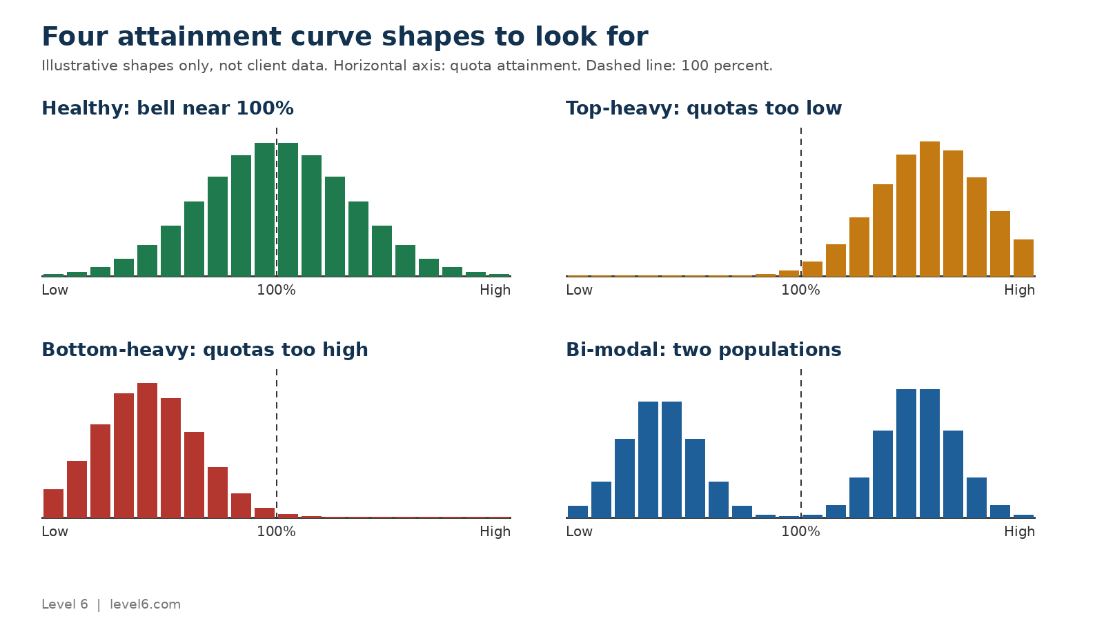
A healthy attainment curve is roughly bell-shaped and centered near 100 percent. Alexander Group describes “a balanced, normally distributed mix” of reps earning outstanding pay beyond 100 percent of goal and reps below 100 percent. It also notes attainment generally follows a positively skewed distribution with a long right tail, and a longer tail means higher incentive payouts.
Roles such as hunter, farmer, account manager, overlay and first-line manager may have different spreads, but each should be bell-shaped and centered around 100 percent. Alexander Group warns against managing the standard deviations, which leads to artificially manipulating pay. Instead, “test and manage for displaced, multi-modal and overall skewed results.”
What benchmark ranges are published?
- The same Alexander Group 2015 article on quota distributions says typically about 60 percent of reps should hit plan or greater and about 40 percent will be below goal, varying slightly by industry. For a balanced payout, two-thirds should achieve or exceed quota.
- The 2023 Alexander Group quota diagnostics ebook gives an example ideal: 90 to 95 percent reaching threshold, 80 to 85 percent between threshold and excellence, 60 to 70 percent at or above target, 5 to 10 percent reaching excellence, and the bottom 5 to 10 percent entering a performance improvement program.
Why do the benchmarks differ?
Published benchmarks vary, even within one firm’s guidance. The first range describes a balanced payout, while the second is an example of an ideal distribution with several tiers. Use these ranges as a reference, then set your own target band by role and market.
What Do the Four Broken Distribution Patterns Tell You?
We use four patterns as a diagnostic checklist, each with different likely causes and a different first move.
1. Top-heavy: too many reps above quota
When most reps finish well above 100 percent, quotas are probably too low. Alexander Group notes that when goals are set too low, even the lowest performer reaches high attainment, leading to high payouts. Its whitepaper on quotas set too high or too low adds that payouts run much higher than target and money is left on the table, because reps generally respond well to stretch goals.
Alexander Group notes that companies with high growth often end up overpaying. First move: check whether overachievement is broad or concentrated in certain territories or products, and compare quotas to market potential. If forecasts keep landing low, read our post on preventing sandbagging in sales compensation.
2. Bottom-heavy: too few reps at quota
When most reps miss, quotas are probably too high. The whitepaper says cost of sales rises, but the real impact is lower morale and higher turnover, and low-growth companies using aggressive quotas to spur growth often end up with few reps at quota. First move: compare the sum of rep quotas to the company number to measure over-allocation, and check when quotas were released.
3. Bi-modal: two peaks
A two-peaked attainment distribution can reflect two different populations. That is a statistics principle, not a sales finding: the NIST handbook’s bimodal histogram guidance says two peaks can come from a mixture of two separate processes, and the challenge is to determine why.
Alexander Group describes a large software company with high compensation costs despite hitting growth goals. The cause was a bi-modal distribution driven by misalignment between job role and plan design. Alexander Group estimated the company could cut compensation costs by around $9 million a year by normalizing the distribution. First move: cut by role, tenure and geography until the peaks separate.
4. Flat or very wide: no clear center
This pattern is our reasoning, not a published benchmark. When reps spread evenly from far below to far above quota, quota may not be tracking opportunity. Possible causes are territory imbalance, inconsistent quota assignment across managers, or mechanics that do not reward incremental effort. First move: check territory balance and whether quota size tracks territory potential.
How Do the Distribution Patterns Compare?
The four patterns differ in what they may signal and what to check first, as the table shows.
| Distribution pattern | What it usually signals | First thing to check | Typical fix |
|---|---|---|---|
| Top-heavy (many above quota) | Quotas set too low, payouts above target | Quota versus market potential by territory and product | Re-cut quotas, review forecast inputs for sandbagging |
| Bottom-heavy (few at quota) | Quotas set too high, morale and turnover risk | Over-allocation above the company number, release timing | Reset allocation, release quotas earlier, apply relief rules consistently |
| Bi-modal (two peaks) | Possibly two populations on one plan, with a role and plan mismatch to test | Cuts by role, tenure and geography | Separate plans or quota methods by role, fix ramp treatment |
| Flat or very wide | Our reasoning: possible inconsistent quota assignment or territory imbalance | Territory balance and consistency of quota assignment | Rebalance territories, standardize the quota method |
| Healthy bell near 100 percent | Plan and quotas roughly aligned | Sub-group cuts for hidden problems | Keep reviewing each period |
Is It a Plan Design Problem or Something Else?
A broken curve does not always mean a broken plan. The Alexander Group ebook on quota diagnostics says the analysis typically points to issues with the quota-setting process, deployment or new market data. Root causes can also be talent issues, such as enablement or training, and go-to-market or market-condition changes.
- Quota-setting: the ebook lists a top-down approach without rep collaboration, adding a percentage to last year’s performance, starting or releasing quotas late, over-allocation driven by corporate expectations, and poor insight into market potential.
- Territory and deployment: sustained geographic gaps often trace to inconsistent practices.
- Ramp: new hires clustered at the bottom point to ramp treatment.
- Enablement: reps with balanced territories who still miss may need training before a pay change.
- Market: if every group shifts together in the same period, test for a market change.
- Plan design: a pattern that follows role or plan lines, may point to the plan itself, as in the single software-company case Alexander Group describes, so test it before redesigning.
The ebook adds that “trial and error quota-setting processes are expensive,” which is why we narrow the cause with attainment distribution analysis before paying for a redesign.

Where do sandbagging and quota relief fit?
We treat both as possible distortions to rule out, which is our reasoning rather than a published finding. Sandbagging may make quotas look easier than they are, so see how to prevent sandbagging. Inconsistent relief may mask a bottom-heavy pattern; our guide on quota relief decisions covers fair rules. Alexander Group’s whitepaper also lists quota pushing and pulling as a side effect when the process goes bad.
What Should You Do After the Diagnosis?
Match the fix to the cause your attainment curve analysis found:
- Re-cut quotas when the problem is allocation or market potential, using a structured quota planning process.
- Adjust the sales compensation threshold gate when too many reps earn on low performance.
- Tune accelerators in sales commission plans when the right tail drives cost or top performers lack a reason to stretch.
- Revisit caps carefully, since they limit cost but can blunt effort. See commission caps and sales performance.
- Plan the rollout with clear communication, using our guide to sales compensation plan change management.
For related program design, see our sales incentive programs page.
Why Is It Worth Getting the Curve Right?
Quotas tied to pay can change behavior. Harvard Business School Working Knowledge describes a field experiment by Doug Chung and Das Narayandas with 80 full-time salespeople selling water purifiers at an Indian consumer durables company over six months in 2013. Sales rose roughly 20 percent when a bonus was conditioned on hitting a quota set 20 percent above typical sales volume.
With no conditions, gains dropped to half that in one scenario and to a net decrease of 8 percent in another. This was one experiment in one company and country, with a weekly bonus. It shows quotas can motivate, not what any given plan will do, which is why the quota attainment curve is worth checking.
What Have We Seen in Level 6 Client Work?
Once a diagnosis points to plan design, your commission system has to allow the fix. One furniture manufacturer we worked with was locked into an expensive SaaS commission model with canned reports, unfamiliar verbiage, and an inflexible new-hire payroll setup that did not fit its internal processes.
Introducing new variations of commission earnings was difficult or impossible, so the company was stuck with a one-size-fits-all model. The approved client result was $150,000 per year in savings.
This was not a quota attainment distribution project, so we do not claim the diagnosis produced the savings. It illustrates a narrower point: if your system cannot model a new plan variation, the analysis tells you what is wrong but you cannot act on it.
How Can ICM Software Support the Routine?
The Level 6 platform is built to mirror your plan logic, lets reps monitor quota attainment, and exports compensation data to your BI platform, where analysts build the histogram.
The Level 6 incentive compensation management platform is built to mirror a client’s exact compensation logic rather than force rigid templates. It supports commission structures by role, title, territory or product line, multiple tiers with accelerators and thresholds, guarantee tracking, split commissions, and territory insights on balance, opportunity and coverage gaps.
Dashboards show earnings, goal progress, leaderboards and forecasted payouts, and reps can monitor quota attainment. Data can update daily, weekly or in real time, and compensation data can be exported to your own BI platform. See our post on ICM implementation or browse all Level 6 solutions.
Frequently Asked Questions
What is quota attainment distribution analysis?
Quota attainment distribution analysis is the practice of charting every rep’s attainment for a period in a histogram and reading the shape of the curve. Instead of relying on the team average, it shows how many reps landed in each attainment band. We read the shape to decide whether quota-setting, territory or plan design problems deserve a closer look.
How do you build a quota attainment histogram?
Alexander Group recommends taking at least three years of performance data and creating a histogram with buckets for every 10 attainment points. Count how many reps fall into each band, then read the center, spread, skew and any second peak. Repeat the chart by geography, role, tenure, product and vertical to test which groups drive the overall shape.
What is a good quota attainment percentage?
Published benchmarks vary. Alexander Group guidance has cited about 60 percent of reps at plan or greater, two-thirds for a balanced payout, and 60 to 70 percent at or above target in a 2023 example. Because the ranges differ and depend on role and market, set your own target band and document why it fits your selling model.
What does a bi-modal attainment distribution mean?
A bi-modal attainment distribution has two peaks, which in statistics can mean two separate populations are mixed together. In sales, that may point to reps in different roles, tenure groups or territories sharing a plan. Cut the data by role, tenure and geography to see whether the peaks separate, then decide whether the plan or quota method needs to differ.
What happens when quotas are set too low?
When quotas are too low, most reps finish above goal and the curve becomes top-heavy. Alexander Group notes that revenue may beat projection, but payouts run well above target, planning becomes harder, and money is left on the table because reps generally respond well to stretch goals. Start by comparing quotas to market potential by territory and product.
What happens when quotas are set too high?
When quotas are too high, few reps reach goal and the curve becomes bottom-heavy. Alexander Group says the cost of sales rises, but the bigger impact is lower morale and higher turnover. Low-growth companies using aggressive quotas to spur growth often land here. Check whether rep quotas were over-allocated above the company number and whether they were released late.
How often should you review your attainment distribution?
Alexander Group advises analyzing quota distributions at the end of each performance period. A single chart is only a snapshot, so in our practice we compare each period against several years of history to see whether a pattern is one-time or structural. Read the attainment curve alongside turnover, missed goals and compensation cost, since those are the outcomes an unbalanced distribution is linked to.
How do you calculate quota attainment?
Quota attainment is a rep’s actual results divided by the quota for the same period, shown as a percentage. In Alexander Group’s example, a rep with a quarterly quota of 100,000 who generates 75,000 has 75 percent attainment. Calculate it for every rep, then chart the results to see the distribution rather than relying on one team figure.
Final Takeaways
- The team average hides the problems. A quota attainment distribution analysis shows the shape behind the number.
- Use at least three years of data, 10-point buckets, and sub-group cuts by geography, role, tenure and product.
- Published benchmarks vary, so set your own target band by role and market.
- Top-heavy, bottom-heavy, bi-modal and flat curves point to different causes. Rule out quota-setting, territory, ramp, enablement and market issues before redesigning the plan.
- Your commission system has to be flexible enough to act on what the attainment curve tells you.
If your attainment distribution looks off and you want a second set of eyes on the cause, talk with the Level 6 team about your plan and data.