
By Claudine Raschi, MS · Last updated: July 2026
Quick Answer: What is an employee service award program?
An employee service award program is a structured plan that recognizes tenure milestones with meaningful awards. To stay tax-efficient, awards must be tangible personal property under IRS rules, with exclusions of $400 (non-qualified) or $1,600 (qualified) per employee per year.
Designing an employee service award program is one of the highest-leverage moves a total rewards team can make. Done well, it strengthens retention, reinforces culture, and stays fully compliant with IRS tax rules. Done poorly, it wastes budget, triggers unexpected payroll taxes, and fails to move the metrics that matter.
We built this guide for HR Directors, Total Rewards Managers, and VPs of HR who are designing a new program or overhauling an old one. Below, we cover why these programs matter, how to structure milestones, which gifts qualify under IRS rules, common mistakes, the tax thresholds you must respect, and how to roll the program out.
What is an employee service award program and why does it matter?
An employee service award program is a formal, repeatable system for recognizing employees at defined tenure milestones — typically year 1, 3, 5, 10, 15, 20, and 25+. It differs from spot recognition or performance bonuses because it rewards loyalty rather than a single achievement.
The business case rests on retention. According to Gallup, well-recognized employees are 45% less likely to have turned over after two years, based on data collected between 2022 and 2024. That single statistic often justifies the entire program budget.
The problem is that most recognition falls short. Gallup reports that only 22% of employees say they receive the right amount of recognition for their work — a figure unchanged since 2022. That gap is both a risk and an opportunity for any organization building a deliberate service award program.
Recognition also directly influences job-hunting behavior. Gallup found that employees receiving high-quality recognition are 65% less likely to be actively looking for another job. A well-designed employee service award program converts these findings into a concrete, budgeted retention lever.
Why generic recognition doesn’t work
One-size-fits-all awards undermine the personalization that makes recognition meaningful. When every employee at year 10 receives the identical plaque, the gesture reads as an obligation, not appreciation. The most effective programs give employees genuine choice within a defined framework.
In our own work, a Fortune 500 client found that offering choice rather than a standard, uniform award increased participation by generating a sense of ownership. The same principle applies to tenure recognition: choice signals respect for the individual.
How do you design the milestone structure?
The milestone structure is the backbone of any employee service award program. It defines which anniversaries you celebrate, how much you invest, and how awards scale with tenure. A clear structure keeps budgeting predictable and expectations transparent.
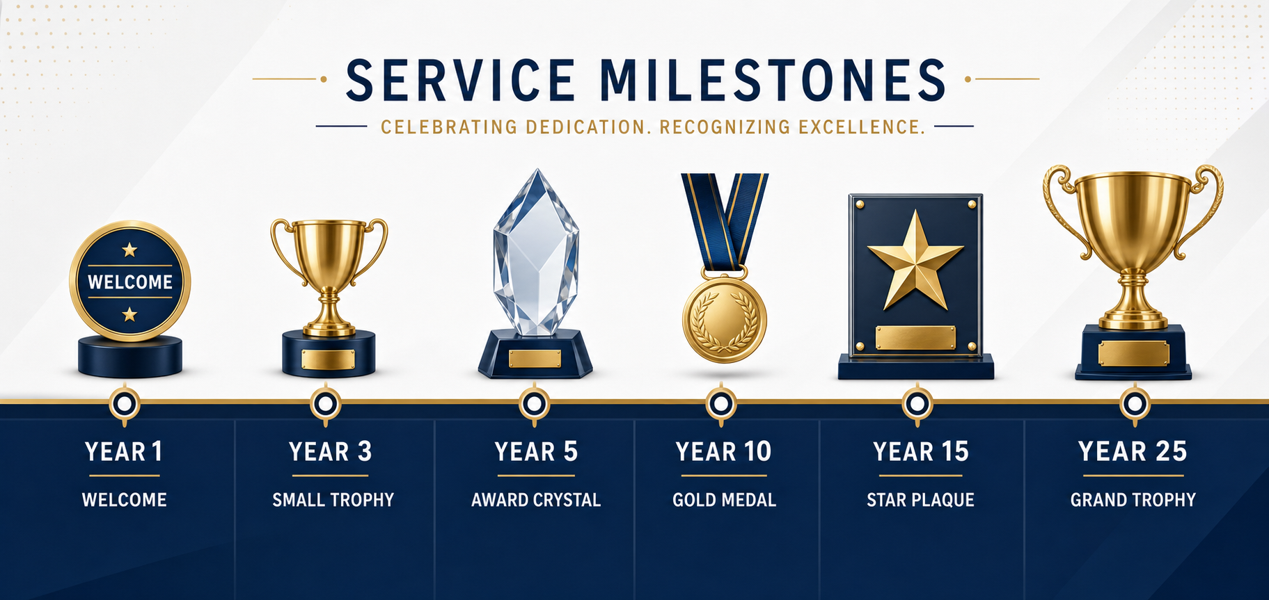
Here is a standard milestone map we recommend as a starting point:
Recommended milestone and budget tiers
- Year 1: Welcome and first-anniversary recognition — small and personal. Budget: $25–$75.
- Year 3: First significant tenure milestone for many organizations. Budget: $50–$150.
- Year 5: First IRS-qualified service award milestone. Budget: $100–$400 (non-qualified) or up to $1,600 under a qualified plan.
- Year 10: Mid-career recognition. Budget: $200–$500+.
- Years 15, 20, 25, 30+: Long-service milestones with progressively meaningful gifts and a formal presentation component. Budget: $500–$1,500+.
A common design mistake is waiting until year 5 to start recognizing tenure. According to the Bureau of Labor Statistics, median employee tenure in the U.S. was 3.9 years in January 2024, meaning many employees leave before reaching a traditional first milestone. Starting at year 1 helps you reach people while they are still deciding whether to stay.
Because IRS tax exclusions for length-of-service awards apply only at year 5 and beyond, year 1 and year 3 awards should be modest, tangible, and personal. This keeps early recognition below the threshold where tax planning becomes a concern while still building the habit of appreciation into your program.
While a companion post on celebrating long-service employee anniversaries covers gift ideas in depth, the table below summarizes the tangible-property award types that work best at each milestone stage.
| Milestone | Suggested tangible award types | Budget range |
|---|---|---|
| Year 1 | Personalized keepsake, branded gear, engraved item | $25–$75 |
| Year 3 | Curated gift set, quality branded merchandise, experience kit (tangible components) | $50–$150 |
| Year 5 | Crystal award, name-brand product, curated catalog selection (first IRS-qualified milestone) | $100–$400 |
| Year 10 | Premium tangible gift, jewelry, high-end branded product, catalog choice | $200–$600 |
| Year 15 | Luxury tangible item, commemorative piece, premium catalog selection | $400–$900 |
| Year 20+ | Heirloom-quality item, premium catalog with wide tangible selection, formal presentation piece | $600–$1,500+ |
All items at every tier must be tangible personal property. Cash equivalents at any dollar value disqualify the award from IRS exclusion treatment.
Which gifts qualify under IRS rules?
Only tangible personal property qualifies for tax exclusion in an employee service award program. Cash, gift cards, tickets, meals, travel, securities, and similar cash-equivalent benefits are always taxable, regardless of amount.
The authority is IRS Publication 5137, which codifies the rules under IRC Section 274(j) — the Internal Revenue Code provision governing employee achievement awards. Under Section 274(j), an employee achievement award is defined as “an item of tangible personal property (not cash) for length-of-service or safety.” Getting this right protects employees from unexpected tax bills and keeps your program operating as designed.
What is always taxable — even under the dollar limits
Certain award types are always taxable regardless of amount because they are not tangible personal property. Per IRS Publication 15-B, these include:
- Cash and cash equivalents
- Gift cards, gift certificates, and gift coupons
- Savings bonds
- Vacations, meals, and lodging
- Theater and sports tickets
- Stocks, bonds, and other securities
This is why using cash or gift cards inside a service award program is a costly mistake: the award becomes fully taxable and often feels impersonal.
How curated choice catalogs stay compliant
Choice and compliance are not mutually exclusive. According to IRS Publication 5137, if an award grants only the right to select tangible personal property from a limited, preselected catalog, it may still qualify for the exclusion. This is the mechanism that lets a modern service award program offer personalization without sacrificing tax treatment.
A curated, tangible-only selection catalog gives employees ownership over their award while keeping every option inside the tangible personal property rule. When we help clients design an employee service award program, this catalog approach is often the single most important structural decision.
What common mistakes should you avoid?
Most employee service award program failures trace back to a small handful of avoidable errors. Before you finalize your design, check your plan against these three.
Mistake 1: Starting recognition at year 5
Waiting for the first IRS-qualified milestone ignores how short tenure has become. With median U.S. tenure at just 3.9 years, a program that starts at year 5 misses a large share of the workforce entirely.
Mistake 2: Using gift cards as the default award
Gift cards feel convenient to administer, but they are cash equivalents and always taxable, no matter how small the amount. Defaulting to gift cards quietly converts a recognition budget into extra payroll tax work.
Mistake 3: Forgetting the written plan
Without a documented, non-discriminatory written plan, your employee service award program is capped at the $400 non-qualified exclusion. Skipping this paperwork step is one of the most expensive oversights an organization can make.
What are the IRS tax rules for service awards in detail?
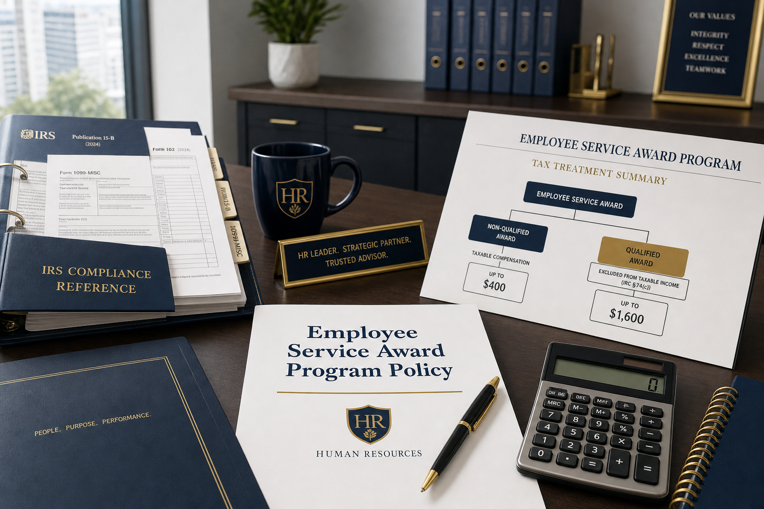
The core IRS rules for an employee service award program are: awards must be tangible personal property; exclusions cap at $400 (non-qualified) or $1,600 (qualified plan); no qualified award is allowed in the first five years of employment; no more than one qualified award per five-year window; and the program must have a written, non-discriminatory plan and include a meaningful presentation. Together these rules, codified primarily in IRC Section 274(j) and Publication 5137, define what separates a tax-advantaged recognition investment from unintended payroll tax.
The $400 and $1,600 exclusion limits
According to IRS Publication 5137, the maximum excludable amount for awards to a single employee in a calendar year is $400 for awards made under a non-qualified plan, and $1,600 in total for awards made under both qualified and non-qualified plans. If an award exceeds these limits, the entire award — not just the excess — is included in the employee’s wages.
What makes a plan “qualified”?
To access the higher $1,600 exclusion, you need a qualified plan. Per IRS Publication 5137, a qualified plan award must be made under an established written plan that does not discriminate in favor of highly compensated employees. For 2026 testing, highly compensated generally means those earning more than $160,000 or who are 5% owners.
The written-plan requirement matters more than many HR teams realize. Without a documented plan, you are limited to the $400 non-qualified exclusion, and you forfeit the additional room the $1,600 qualified limit provides. A written plan document is therefore a tax asset, not just a policy nicety.
The 5-year timing and frequency rules
Two timing rules govern length-of-service awards. First, IRS Publication 5137 states that an award does not qualify if the employee received it during their first five years of employment. This is why year 5 is the first IRS-qualified milestone.
Second, an award does not qualify if the employee received another length-of-service award — other than one of very small value — during the same year or in any of the prior four years. In practice, qualified awards can be given no more than once every five years. Traditional retirement awards are an exception to the five-year first-award rule.
One more condition matters. IRS Publication 5137 requires that the award be given as part of a meaningful presentation and not be disguised wages. A rushed handoff at a desk can technically fail that standard, so the ceremony matters for compliance as well as morale.
For related guidance on smaller, non-milestone gifts, review our explanation of the de minimis rule, which governs low-value benefits that fall outside the achievement award framework.
How do you roll out and communicate the program?
A well-designed employee service award program fails if no one understands it. Rollout and communication determine whether it becomes part of your culture or sits unused in an HR portal.
Formalize the written plan first
Before anything else, put the written plan in place. This document should define eligibility, milestone intervals, award levels, and the distribution process — and it is the same document that unlocks the $1,600 qualified exclusion.
Treat this as step one, not a formality to backfill later. Every later rollout decision — training, announcements, integration — should point back to what the plan already specifies.
Train managers first
Managers are the delivery mechanism for recognition. Once the plan is documented, equip them to understand the milestone schedule, the presentation expectations, and why the awards are tangible rather than cash. When managers can explain the “why,” the recognition lands as genuine rather than transactional.
This training directly supports the “meaningful presentation” requirement in IRS Publication 5137. A manager who presents a year-10 award with context and appreciation satisfies both the compliance standard and the emotional purpose of the program.
Announce clearly and integrate with your systems
Launch the employee service award program with a clear announcement that explains milestones, award choices, and how employees will be notified when they qualify. Ambiguity kills participation, so publish the milestone map where everyone can see it.
Integration is the operational backbone. Connecting the program to your HRIS lets tenure milestones trigger automatically, removing the risk of a missed anniversary. Automated tracking also helps enforce the IRS frequency rules, since the system can flag whether an employee already received a qualifying award in the prior four years.
One healthcare services client we worked with found that co-branding the recognition experience increased overall program activity by more than 30% over the previous design. Thoughtful communication and branding are not cosmetic — they materially change how employees engage.
Gather feedback after launch
Rollout is not the finish line. After launch, survey employees about the award selection and presentation experience.
Use that feedback to refine the catalog or retrain managers where the presentation fell flat. An employee service award program that improves each cycle stays relevant far longer than one that launches once and is never revisited.
If you want a platform that handles catalog curation, milestone tracking, and compliance in one place, explore our recognition solutions.
How do you measure employee service award program success?
A strong employee service award program is measurable. Tracking the right metrics tells you whether your investment is driving retention and engagement or simply going through the motions.
The four most useful metrics are participation rate (what percentage of eligible employees receive their award on time), voluntary turnover among recognized employees versus those not yet recognized, eNPS or engagement survey scores before and after program launch, and milestone message open rate if you send automated anniversary notifications. Together these create a before-and-after picture of program impact that HR can report to leadership.
A healthcare services organization we worked with tracked program activity across two cohorts and found that employees in the active recognition track had more than 30% higher engagement with company communications than the comparison group. Measurement is what turns a recognition program from a feel-good expense into a defensible retention investment.
Frequently asked questions
Below we cover the most common questions about employee service award program design — from IRS timing and dollar limits to gift-card treatment, qualified-plan rules, employee award choice, and why starting before year 5 matters.
When does the first service award qualify for tax exclusion?
An award does not qualify if the employee received it during their first five years of employment, according to IRS Publication 5137. Year 5 is therefore the first IRS-qualified milestone, though you can still recognize earlier anniversaries with modest tangible gifts.
How often can employees receive a qualified service award?
A length-of-service award does not qualify if the employee received another such award during the same year or in any of the prior four years, per IRS Publication 5137. In effect, qualified awards can be given no more than once every five years.
What is the difference between the $400 and $1,600 limits?
According to IRS Publication 5137, $400 is the maximum excludable amount per employee per year under a non-qualified plan, while $1,600 is the total maximum across both qualified and non-qualified plans. Accessing the $1,600 limit requires an established written plan.
Are gift cards allowed in a service award program?
Gift cards are not allowed as tax-free awards in an employee service award program. Gift cards, gift certificates, and gift coupons are always fully taxable, regardless of amount, because they are not tangible personal property under IRS Publication 15-B. The same rule applies to cash, savings bonds, vacations, meals, tickets, and securities — all are taxable no matter how small the dollar value.
What makes a service award plan “qualified”?
A qualified plan, as defined under IRC Section 274(j) and IRS Publication 5137, must be an established written plan that does not discriminate in favor of highly compensated employees. For 2026, highly compensated means those earning more than $160,000 in the prior year or who are 5% owners. The written plan is what unlocks the higher $1,600 per-employee exclusion limit and is the single most important compliance document for any employee service award program.
Can employees choose their own award and still keep the tax exclusion?
Yes — provided the choice is limited to tangible personal property from a preselected catalog. IRS Publication 5137 allows an award that grants only the right to select from a limited, preapproved set of tangible items to qualify for the exclusion. This means a well-structured employee service award program can offer genuine employee choice while remaining fully compliant. The key constraint is that every option in the catalog must be tangible property — no cash, no gift cards, no experiences like vacations.
Why should we start recognition before year 5?
With median U.S. tenure at just 3.9 years per the Bureau of Labor Statistics, many employees leave before reaching year 5. Recognizing year 1 and year 3 with modest tangible gifts helps retain people during the period when they are most likely to leave.
Final takeaways
Design early, document everything, use tangible awards, stay within IRS limits, train your managers, and measure results after launch. Here is a summary of the key principles.
- An employee service award program is a proven retention lever: Gallup found well-recognized employees are 45% less likely to turn over after two years.
- Structure milestones from year 1 through 25+, and start recognizing before year 5 since median U.S. tenure is only 3.9 years (BLS, 2024).
- Avoid the three most common mistakes: starting at year 5, defaulting to gift cards, and skipping the written plan.
- Only tangible personal property qualifies for tax exclusion; cash, gift cards, tickets, and securities are always taxable under IRS Publication 15-B.
- Respect the thresholds: $400 under a non-qualified plan and $1,600 under a written qualified plan, per IRS Publication 5137.
- Awards during the first five years, or more than once in any five-year window, do not qualify.
- Curated tangible-only catalogs let you offer choice while staying compliant.
- Formalize the written plan first, train managers, communicate clearly, integrate with your HRIS, and gather feedback after launch to keep improving.
Ready to design a compliant, high-impact program?
Level 6 has helped organizations build and modernize employee service award programs for more than 25 years. If you are designing a new program or overhauling an existing one, contact our team to see how curated award catalogs, milestone automation, and built-in IRS compliance can work together.